
Responsive Web Design Fundamentals
Learn how to create websites that work beautifully on phones, tablets, and desktops. Master flexible grids and fluid layouts.
Read ArticleBring your designs to life with micro-interactions and animations. Learn what makes a site feel responsive and engaging without overwhelming your visitors.

Animation isn’t just eye candy. When done right, it guides users through your site, confirms their actions, and makes interactions feel natural. It’s the difference between a website that feels static and one that feels alive.
We’ve trained over 450 students in interactive design techniques. Most notice that their designs feel significantly more professional once they add thoughtful animations. The thing is, it’s not about adding motion everywhere — it’s about being strategic.
Motion design follows the same principles as traditional animation. You’ve got timing, easing, anticipation, and follow-through. When you understand these fundamentals, you can create animations that feel intentional rather than random.
Here’s the practical part: a 300ms button animation that eases out cubic-bezier(0.34, 1.56, 0.64, 1) feels snappy and responsive. A 1200ms page transition with ease-in-out feels elegant. Get the timing wrong and your site feels sluggish or janky. We’ll cover the exact timing patterns that work across different interaction types.
This workshop provides educational guidance on interactive design and animation techniques. While we share industry best practices and technical implementations, actual results depend on your specific design context, audience, and implementation approach. Animation performance varies across browsers and devices — we’ll show you how to test and optimize for your particular needs. This course covers technical skills; professional design outcomes require practice and real-world application.
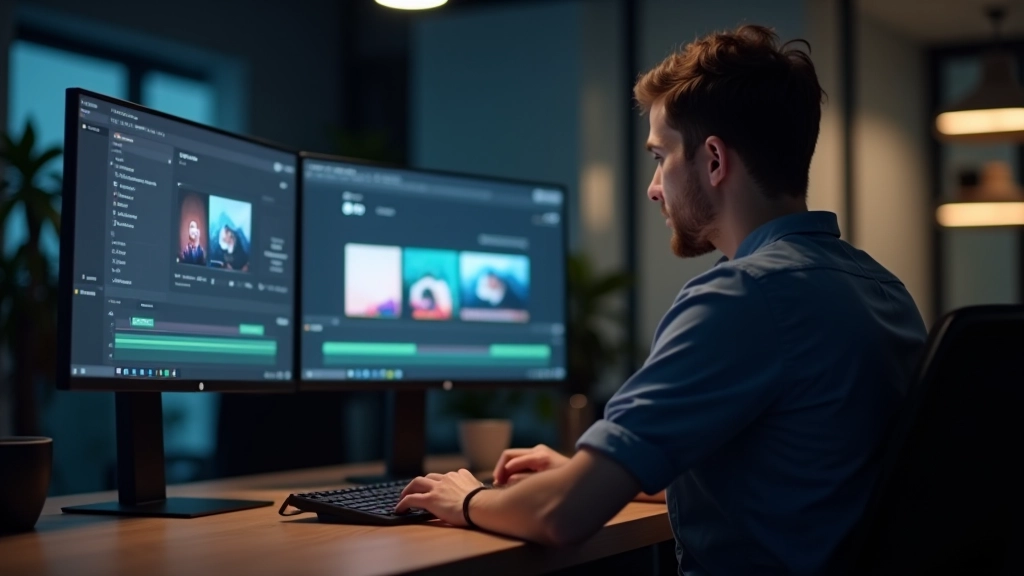
We start with CSS transitions because they’re lightweight and work everywhere. A simple transition: all 0.3s ease-out on your button gives immediate feedback when someone hovers. Then we move into keyframe animations for more complex sequences.
By week two, you’re building actual components. A navigation menu that slides in smoothly. Form inputs that animate to highlight. Loading states that don’t feel like they’re stuck. You’ll learn which animations improve usability and which ones just slow people down.
Performance matters. We don’t just teach animation — we teach animation that doesn’t tank your page speed. You’ll understand transform and opacity (GPU-accelerated) versus animating width and height (not accelerated). The difference is noticeable on real devices.

Animation transforms good websites into great ones. It’s not magic — it’s understanding what makes motion feel right to users and implementing it thoughtfully. Over the four weeks of this workshop, you’ll build a foundation in motion design that’ll stick with you through every project.
The best part? You don’t need fancy tools. CSS animations run everywhere and they’re fast. By the end of this workshop, you’ll have real components you can use immediately. You’ll understand timing, easing, and performance. And you’ll know when to animate and when to stay still.
Explore the full curriculum and see what you’ll create in this 4-week workshop.
Explore All Workshops