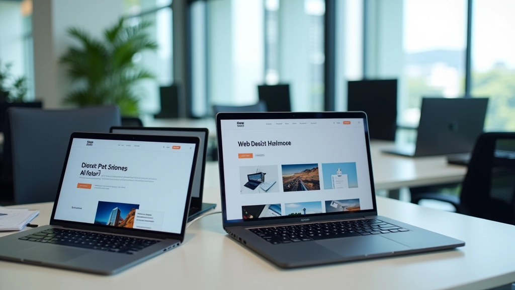
Building Your Design Portfolio Site
Create a portfolio website that actually gets you noticed. We’ll walk through structure, layout, and the techniques that make portfolios stand out.
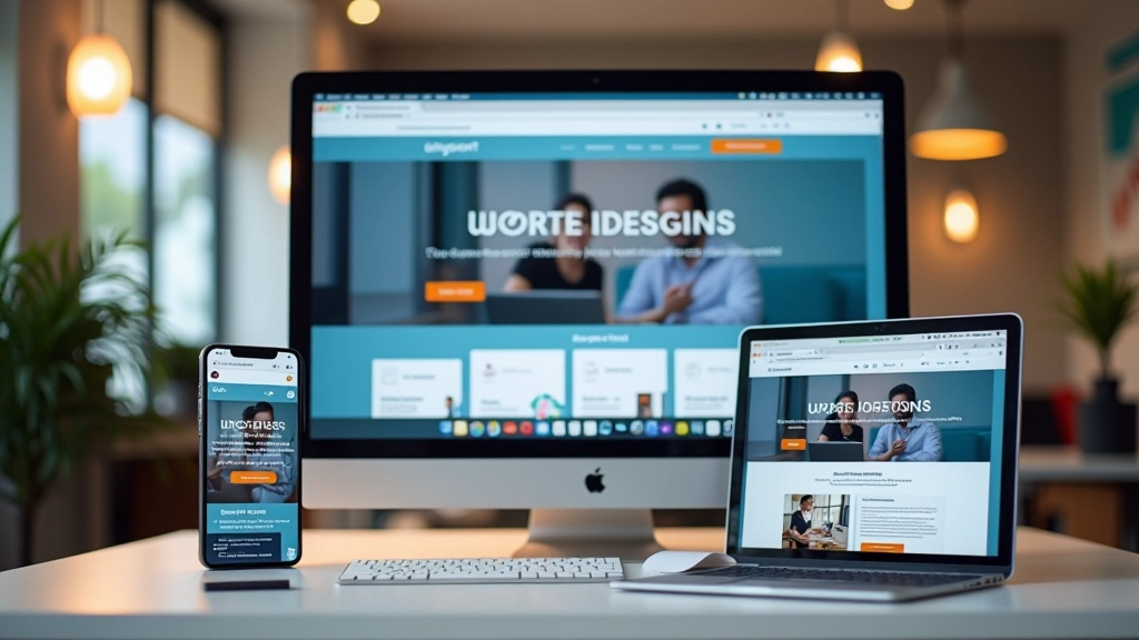
Learn how to create websites that work beautifully on phones, tablets, and desktops. We’ll cover grid systems, flexible layouts, and mobile-first thinking.

Responsive design isn’t some complex mystery. It’s really about making smart choices that work across devices. You’ll learn the core principles that separate amateur websites from professional ones — and you’ll be surprised how straightforward most of it is.
We’re not going to bore you with theory. You’ll actually build responsive layouts using real techniques. By the end of week three, you’ll understand exactly why your site needs to flex and flow. By week six, you’ll be creating layouts that feel natural on every screen size.
Start small, expand thoughtfully. This approach changes how you make design decisions.
Learn CSS Grid and Flexbox properly. These tools make responsive layout actually manageable.
Stop fighting CSS. We’ll show you how to build layouts that adapt naturally without breakpoint hacks.
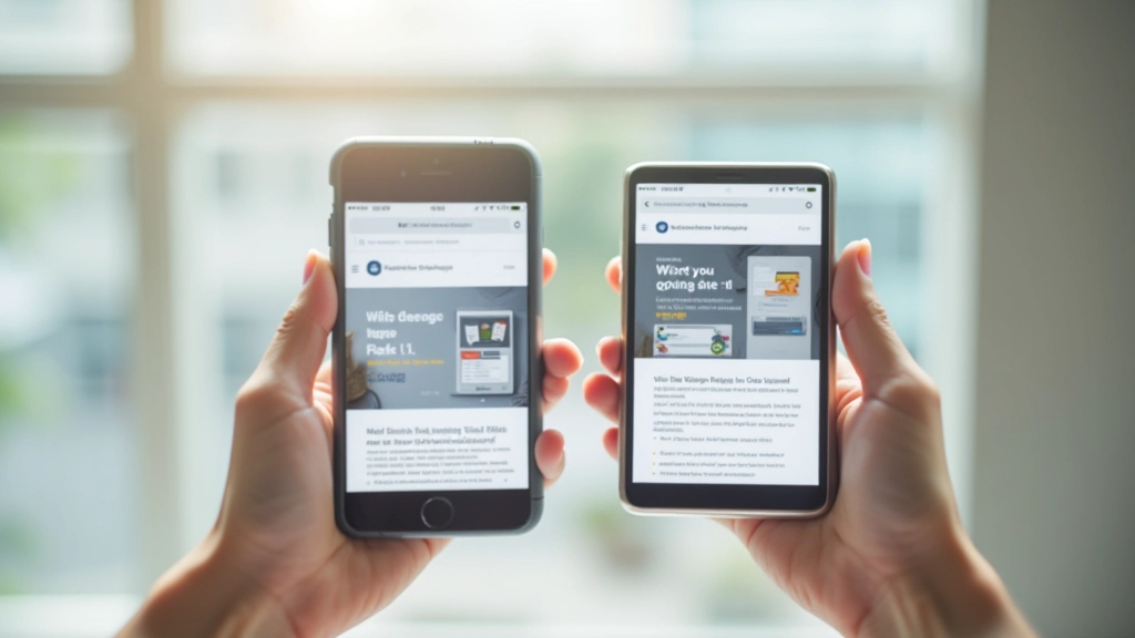
Here’s what we tell everyone: design for mobile first. Not because mobile is trendy. Because it forces you to make better decisions about what actually matters on your page.
When you start with a 375px viewport, you can’t cram everything in. You have to prioritize. Navigation? Simplified. Images? Appropriately sized. Text? Concise. Then you expand to tablet (768px) and desktop (1440px), adding layout complexity only where it helps.
Most designers do it backwards — they design for desktop first, then squeeze everything down for mobile. That’s why so many mobile sites feel broken. We’re not doing that.

This course provides educational information about responsive web design principles and techniques. Every project and scenario you’ll work with is designed to build understanding. Your learning pace will vary — some concepts click immediately, others take a few weeks of practice. That’s completely normal.

You’ll hear people argue about which one’s better. They’re wrong. They’re different tools.
Flexbox is your go-to for one-dimensional layouts — rows or columns. Navigation bars, card containers, button groups. It’s flexible, responsive, and forgiving. If you’re not sure what you need, Flexbox is usually the answer.
CSS Grid handles two-dimensional layouts. Complex page structures with columns and rows working together. Magazine layouts, dashboard interfaces, gallery grids. Grid is powerful but needs more planning.
By week two, you’ll instinctively know which one to reach for. And honestly? Most of your responsive layouts will use Flexbox.

Don’t get stuck on magic numbers. You’ll hear people swear by 480px, 768px, 1024px — like these are laws of nature. They’re not.
Good breakpoints are where your design actually breaks. Build mobile first. Gradually expand the viewport. When something stops working — text gets too cramped, images feel stretched, the layout feels awkward — that’s where you add a breakpoint.
Most projects end up with 3-4 breakpoints: mobile (375-480px), tablet (768-820px), and desktop (1024px+). But your specific design might need different ones. That’s fine. Listen to what the design needs, not what some article says it should need.

Images trip up a lot of beginners. They’ll set a fixed width, then wonder why the image breaks the layout on mobile.
The rule’s simple: max-width: 100%. Every image should be able to shrink down to fit its container. Use height: auto so proportions stay correct. Container gets smaller? Image scales down with it. No breakage.
Videos need the same treatment. Wrap them in a container with padding-bottom to maintain aspect ratio, then set the video to fill that space. By week four you’ll do this without thinking about it.
Responsive design feels overwhelming when you’re reading about it. But when you actually build something? It clicks. You’ll design your first mobile layout and think “wait, that’s it?” You’ll add a tablet breakpoint and watch your layout flex naturally. By the end of week three you’ll wonder how you ever designed any other way.
The fundamentals aren’t magic. They’re just smart decisions applied consistently. Mobile first. Flexible layouts. Breakpoints where needed. Images that scale. That’s responsive design.