
Responsive Web Design Fundamentals
Learn how to create websites that work beautifully on phones, tablets, and desktops using flexible layouts and media queries.
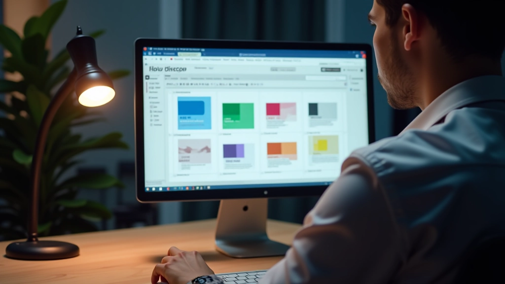
Read ArticleUnderstand the principles that make interfaces intuitive and beautiful. We’ll cover typography, color theory, spacing, and how to make users actually want to click.

Good UI isn’t about making things look pretty. It’s about making things work. When you’re designing an interface, you’re solving a problem for real people. They need to get something done — quickly, confidently, without confusion.
Think about apps you actually use every day. Gmail. Instagram. Your bank’s app. They all follow principles that you probably don’t even notice. That’s the goal. Users shouldn’t be thinking about design — they should be focused on what they’re trying to accomplish. We’re going to break down exactly how that happens.
How to choose colors that work together and make important elements stand out
Font selection, sizing, and spacing that guides users through your content naturally
Using whitespace and alignment to create visual hierarchy and improve usability
You’ve probably heard about contrast in design, but here’s what it actually means in practice. Contrast is about making important things stand out from less important things. Your text needs to contrast with the background. Your buttons need to contrast with regular text. Without contrast, users get confused about where to look and what to do.
The WCAG standard (Web Content Accessibility Guidelines) says text should have at least a 4.5:1 contrast ratio. That’s a technical way of saying “make sure people can actually read your text.” Dark text on light backgrounds, light text on dark backgrounds — either way works. Just don’t put gray text on a light background and call it design. It’s not.
Real example: Buttons. A button should look clickable. If it’s the same color as everything else, users won’t know to click it. You need contrast — either through color, elevation (shadows), or borders. Sometimes all three.
This guide covers fundamental UI design principles used in industry practice. Accessibility guidelines reference WCAG 2.1 standards. Individual project needs may vary — always test your designs with real users and follow your specific platform’s design systems and accessibility requirements.

Font choice is one of the most powerful tools in UI design. You’re not just picking something that looks nice — you’re creating a visual hierarchy that guides users through your interface. Different sizes, weights, and colors tell users what’s important.
Here’s what works: Pick 2-3 typefaces maximum. One for headings, one for body text. Stick with it. San-serif fonts (like Arial, Helvetica, Inter) are standard for web interfaces because they’re clean and easy to read at any size. Serif fonts have their place, but usually not for body text on screens.
Size matters too. Your main heading might be 32px on desktop, body text around 16px. But here’s the thing — these numbers change on phones. You can’t use fixed sizes and expect it to work everywhere. Use relative sizing (rem units) or CSS clamp() functions to scale smoothly across devices. Users on phones need readable text too.
Whitespace (or negative space) is the invisible part of design that actually makes everything else work. It’s the gaps between elements, the padding inside buttons, the margins around text blocks. Without it, everything feels cramped and overwhelming.
Think about a form. If your input fields are packed tight together, users feel rushed. But if you give each field breathing room — space above, space below, space on the sides — suddenly the form feels less intimidating. Same content, completely different experience.
There’s a practical pattern called the “8-point grid system.” Multiples of 8px (8, 16, 24, 32, 40px) create consistent spacing throughout your design. You don’t have to use exactly 8px, but the idea is solid — use consistent increments. This makes your design feel organized and intentional. No random gaps that look like accidents.


UI design principles aren’t rules you memorize. They’re tools you apply to solve problems. Every interface you design should have clear contrast, readable typography, and thoughtful spacing. Users won’t notice these things if they’re done right — and that’s exactly the point.
Start with your next project. Look at the interfaces you use every day. See how they handle contrast. Notice the typography hierarchy. Observe the spacing. You’ll start seeing design patterns everywhere. That awareness is how you become a better designer.